芃创科技
ART DIRECTOR: Oldlee老李
DESIGNER: Oldlee老李
YEAR: 2022
CLIENT: 芃创(广州)科技有限公司
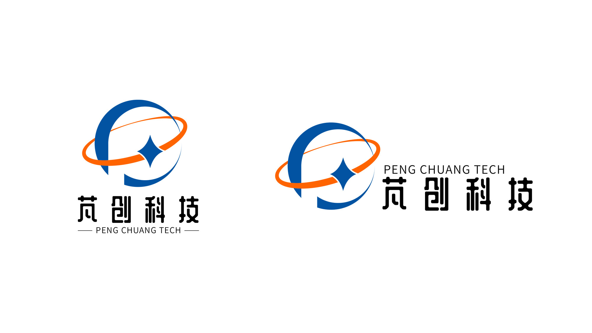
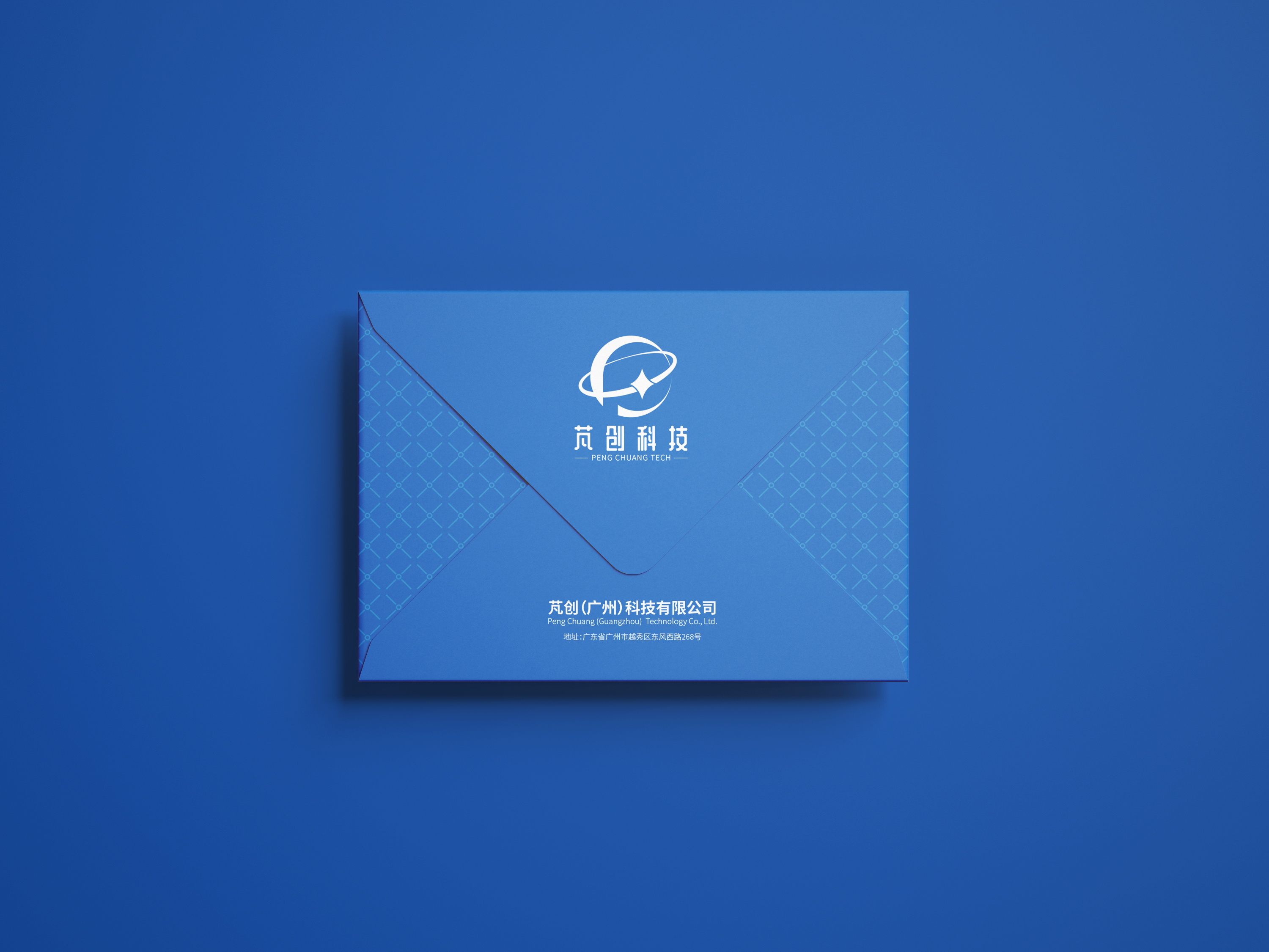
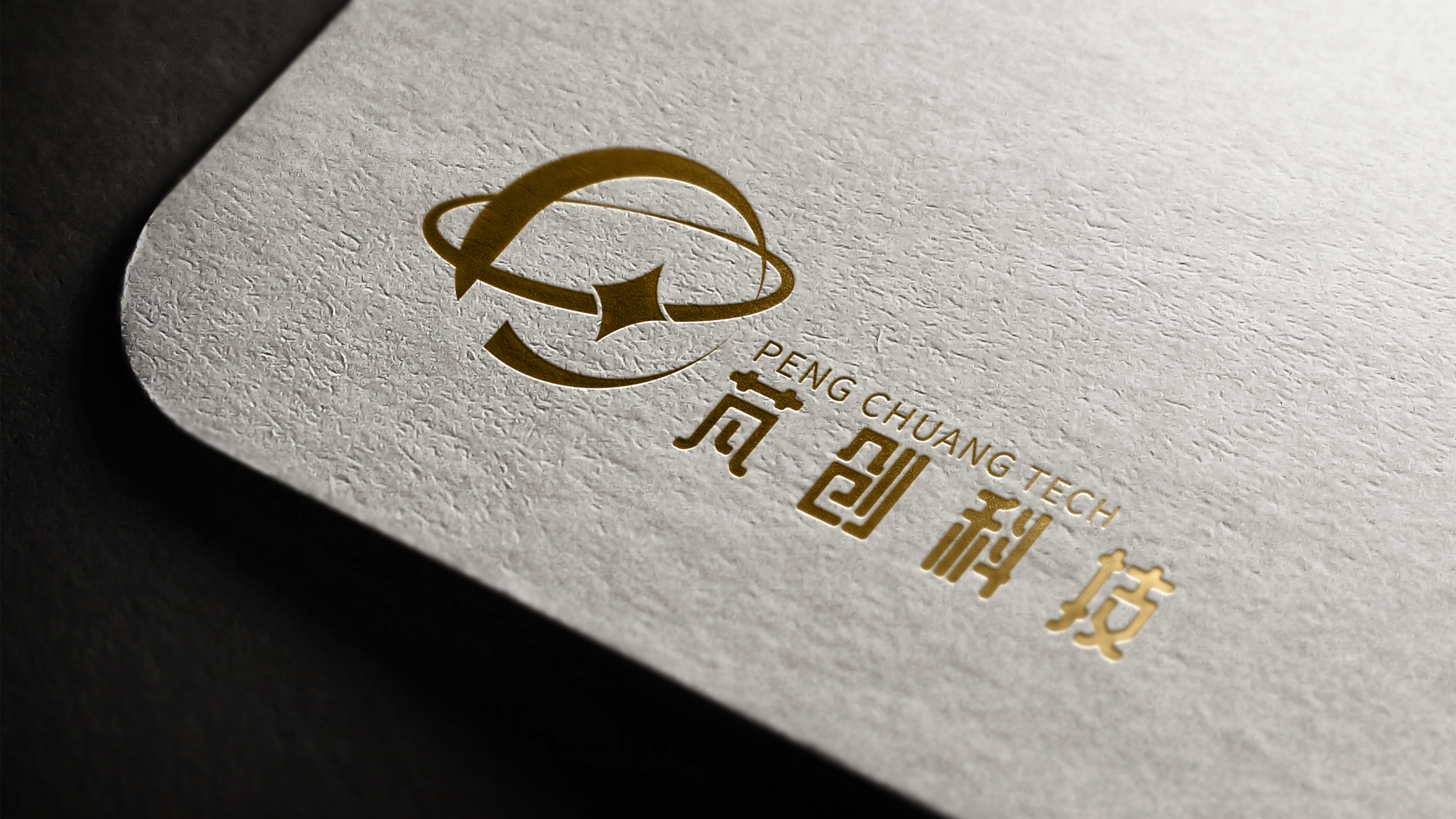
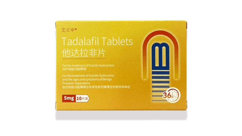
The logo PC letter is composed of abstract elements, and the shape of the logo represents the earth, which means that the company looks to the world and the momentum of the future, to meet the challenges.
This logo has a strong identification, in the same industry can highlight the corporate philosophy.
Through art beautification processing to convey a subtle, atmospheric, stable concept to people, more can reflect the vitality of the enterprise.
Color using international basket and orange, blue reflects the enterprise’s science and technology, orange reflects the enterprise’s passion and hard work.
The smooth arc symbolizes the speed of the company’s development has broken out of the limitations, toward the spirit of integration of The Times and the direction of vigorous development of enterprises.
标志PC字母以抽象的元素构成,标志的外形弧度代表地球,寓意着公司放眼世界展望未来的气势,迎接挑战。
此标志具有强识别性,在同行业中更能凸显企业理念。
经过艺术美化处理向人们巧妙的传达一种含蓄、大气、稳重的理念,更能体现企业的朝气。
色彩使用国际篮与橙,蓝色体现企业的科技化,橙色则体现企业激情努力向上。
流畅的弧度象征公司发展的速度具有冲出局限,走向时代融合的精神和企业蓬勃发展的方向
